

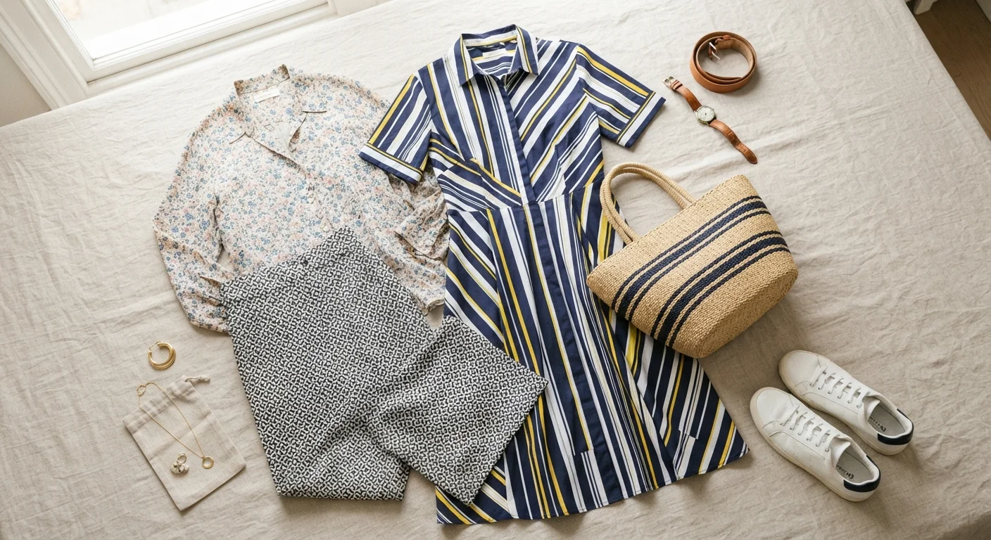
Why Pattern Mixing Feels Intimidating
Most of us were taught — implicitly or explicitly — that patterns clash. That rule made sense as a shorthand, but it left a lot of creative possibility on the table. The truth is that mixing prints isn't inherently risky; it's just a skill that benefits from a framework.
Pattern combinations fail for specific, identifiable reasons: competing scales, no shared color, or too many prints layered at once. Once you understand those failure points, you can sidestep them confidently. The goal isn't to throw caution to the wind — it's to build combinations with enough internal logic that they read as intentional.
Use the Mirror Test Before You Walk Out
Step back three to four feet from a full-length mirror and squint slightly. If your eye travels comfortably around the outfit without snagging on any one spot, the patterns are working together. If one area feels jarring or too heavy, that's your cue to swap a piece.
It also helps to understand the occasion before you go bold. A pattern-mixed outfit that works beautifully for a weekend market or a creative office might read differently in a formal setting. For context on reading the room, Occasion Dressing: Matching Your Outfit to the Setting walks through that decision-making process.
The Core Principles, Step by Step
What's below isn't a list of rules to memorize — it's a repeatable process you can apply every time you open your closet. Work through the steps once or twice and they'll start to feel like second nature.
What you will need
Full-length mirror
Lets you assess the full visual effect of pattern combinations from head to toe before committing.
Neutral anchor piece
A solid-colored item (top, trouser, or layer) used to give the eye a resting point between prints.
Color reference swatch or app
Helps confirm that patterns share at least one complementary or matching color tone.
Anchor the look with a dominant pattern
Choose one print to lead — this is your statement piece. It should be the most visually assertive: the boldest color, the largest scale, or the most eye-catching motif. Everything else you add will support this anchor rather than compete with it.
Select a secondary pattern at a contrasting scale
Once your anchor is chosen, pick a second print that differs noticeably in scale. If your anchor is a large-scale botanical print, try a fine stripe, a mini dot, or a small houndstooth as your second. The contrast in size prevents the two from visually colliding.
Confirm a shared color between both patterns
Pull one color from your anchor print and find it — or a close tonal match — in your secondary pattern. This shared thread is what makes an outfit look styled rather than random. It doesn't need to be an exact match; a warm terracotta in one print echoing a rust stripe in another is enough to unify the look.
For a deeper dive into working with color relationships, see our color coordination guide.
Introduce a solid to give the eye a break
A solid piece — whether it's a blazer, trouser, shoe, or bag — acts as a visual pause between patterns. It prevents the look from feeling relentless. Pull the solid from within the color palette you've already established so it reads as part of a deliberate scheme.
Check proportion and balance across the full outfit
Stand in front of your mirror and evaluate the whole picture. Pattern-heavy tops call for simpler bottoms and vice versa. If both halves of your outfit are loudly patterned, make sure they're separated by a clear color shift or a tonal break at the waist. Accessories count too — a patterned scarf or printed bag adds to the visual load.
For guidance on keeping accessories from tipping the balance, see Accessorizing Without Overdoing It.
Scale Is the Real Secret
The single most common pattern-mixing mistake is pairing two prints of identical size. When scales match too closely, the eye struggles to know where to land. Always contrast — think a wide-stripe top with a small ditsy floral skirt, not two medium-scale geometrics fighting for attention.
More Than Three Patterns Gets Risky
There's a point where layering patterns tips from bold to overwhelming. Three distinct prints is typically the ceiling for a wearable look; beyond that, even expert stylists struggle to maintain visual cohesion. When in doubt, swap one print for a coordinating solid.
Once you're comfortable with two-pattern combinations, you can experiment with a third — typically a thin stripe or simple geometric that acts more like a textural element than a full print. Keep the third pattern subtle and let your anchor do the heavy lifting.
Pattern mixing also pairs naturally with a solid understanding of color. If you want to sharpen that foundation, Color Coordination Without Overthinking It covers the core principles in an accessible, practical way.
The content on this site is for informational purposes only and is not a substitute for professional advice. Always consult a qualified professional for guidance specific to your situation.