

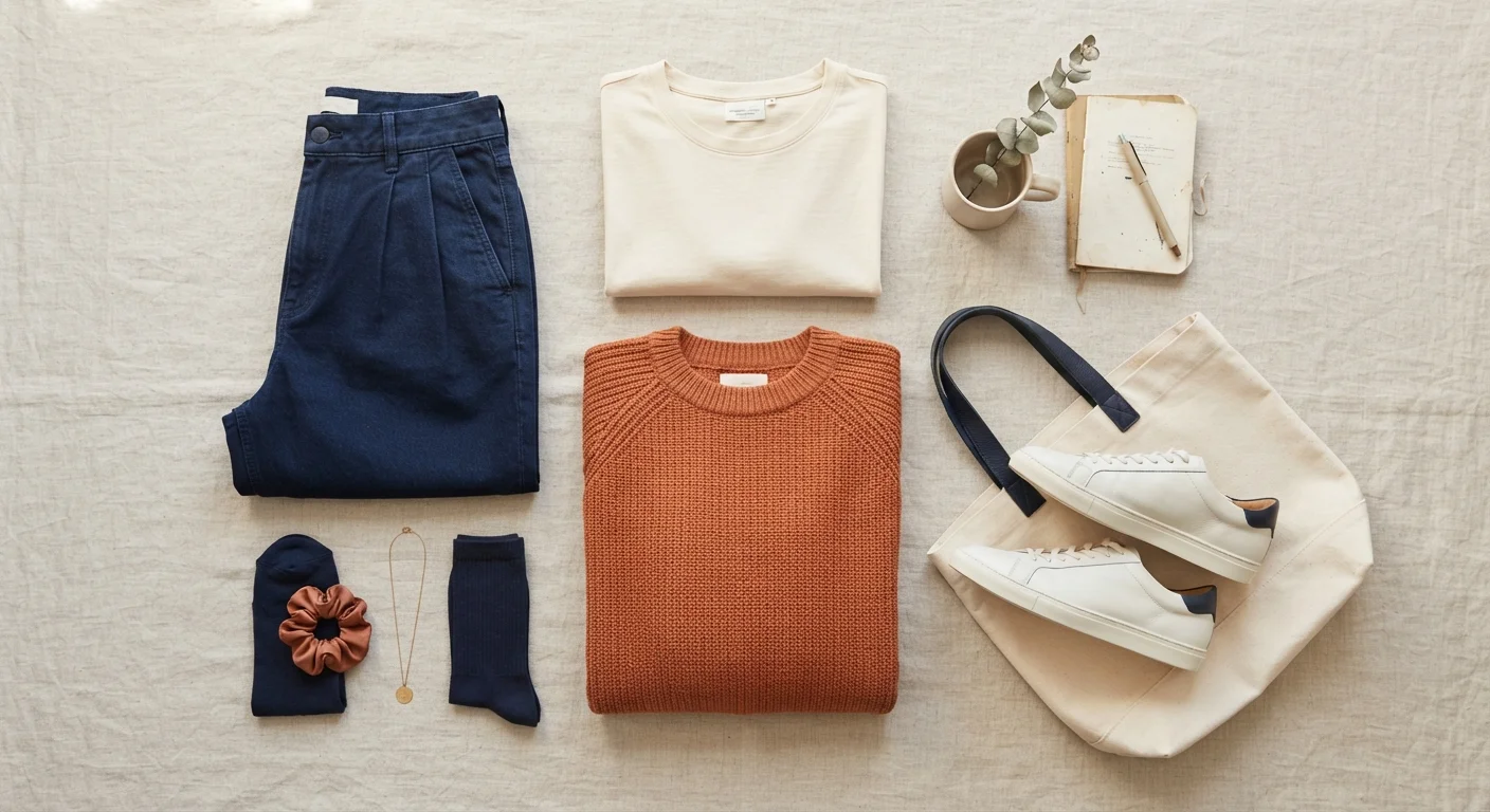
Why Color Coordination Feels Harder Than It Is
Most people who feel stuck on color aren't missing talent — they're missing a framework. Color coordination follows a small set of repeatable principles, and once those click, putting together a cohesive outfit becomes second nature rather than a source of stress.
The good news: you don't need to memorize paint swatches or invest in a new wardrobe. You need to understand a few relationships between colors and learn how to apply them to what you already own. For a beginner-friendly deep dive into the theory side, see our color coordination primer.
What you will need
What You Need Before You Start
Getting dressed with intention doesn't require special tools, but having a clear starting point makes the process smoother. Before working through the steps below, take a few minutes to do a quick inventory.
Your existing wardrobe
The foundation for building and testing color combinations without spending anything.
A color wheel reference (free online versions work well)
Helps you quickly identify complementary, analogous, and triadic color relationships.
A full-length mirror in natural light
Allows accurate assessment of how colors interact when worn together rather than laid flat.
A smartphone camera
Photographing outfit combinations lets you compare options side by side before leaving the house.
Step-by-Step: Building a Coordinated Outfit
Follow these steps whenever you're building an outfit from scratch or troubleshooting a combination that isn't clicking. They work for casual looks, workwear, and everything in between — for more context on dressing for specific settings, check out our guide to occasion dressing.
Identify Your Neutral Base
Start every outfit with a neutral — black, white, cream, grey, navy, camel, or olive. Neutrals don't compete with other colors, which makes them the easiest anchor for any palette. Choose one neutral piece as the foundation: often a bottom (trousers, jeans, a skirt) or a larger layering piece like a blazer or coat.
Pick a Dominant Color
This is the color that takes up the most visual space in your outfit — typically your largest piece after the neutral. It can be a soft, muted tone or something bolder, but keep it to one. A dusty sage green top, a burgundy sweater, or a cobalt blue shirt are all strong dominant colors when paired with a neutral base.
Apply a Basic Color Relationship
Use one of three reliable relationships from color theory to add a second non-neutral color if desired:
- Analogous: Colors that sit next to each other on the color wheel (e.g., green and teal, or rust and mustard). These combinations feel harmonious and cohesive.
- Complementary: Colors opposite each other on the wheel (e.g., blue and orange, purple and yellow). These create energetic contrast — use in smaller doses.
- Neutral + one color: If in doubt, keep the second color neutral. This approach never fails.
For a detailed look at how these principles play out in full outfits, explore pattern mixing principles — the same logic applies.
Balance Proportions (the 60-30-10 Rule)
A simple proportion guide helps any outfit feel intentional: let one color take up roughly 60% of the look (usually your neutral or dominant color), a second take up about 30% (your supporting color), and a third — often an accent introduced through accessories or a small detail — take the remaining 10%. This ratio creates visual hierarchy without requiring any advanced styling instincts.
Assess the Full Look in Natural Light
Artificial lighting — particularly warm incandescent or cool fluorescent bulbs — distorts color significantly. Before finalizing any outfit, check it in natural daylight or near a window. What looked like a cohesive navy-and-green combination indoors might reveal mismatched undertones in full light. If colors genuinely clash under natural light, swap one piece and reassess.
Build a Signature Palette Over Time
Rather than approaching every outfit as a fresh puzzle, consider defining a small personal palette of four to six colors that reliably work together. Most effective wardrobes center on two or three neutrals and two to three recurring accent colors. Over time, this makes getting dressed faster and more consistent without feeling restrictive. See the Style Tips hub for more strategies on building a functional wardrobe.
Common Pitfalls and How to Avoid Them
Even with a solid framework, a few habits tend to trip people up. Wearing too many competing colors at once is the most frequent issue — when everything is equally saturated and bold, nothing reads as intentional. The 60-30-10 proportion rule from Step 4 solves this directly.
Another common mistake is ignoring undertones. Warm and cool versions of the same color (think a golden yellow versus a lime yellow) can clash even when they share a name. When in doubt, hold garments next to each other in natural light before committing.
Finally, don't underestimate the role of texture. A tone-on-tone outfit in linen, denim, and matte cotton reads as deliberate and interesting without introducing a single new color — a concept that pairs naturally with monochromatic dressing. And once your color story is settled, accessories can reinforce it without overwhelming it — our guide to accessorizing without overdoing it covers exactly that balance.
Avoid Chasing Trends at the Expense of Fit
Trending color combinations can be a useful source of inspiration, but they shift seasonally and may not suit your existing wardrobe or personal coloring. Prioritize combinations that feel right on your body in your lighting — not just ones that look appealing on a screen or in editorial imagery.
The content on this site is for informational purposes only and is not a substitute for professional advice. Always consult a qualified professional for guidance specific to your situation.