

Start here
Why Color Feels So Overwhelming
Build your base
Start with Neutrals: Your Coordination Safety Net
Learn the system
The Color Wheel Made Simple
Apply it
Putting It Together: Practical Pairing Strategies
Level up
Tone, Saturation, and Why They Matter
Why Color Feels So Overwhelming
Standing in front of a full closet and still feeling like nothing goes together is one of the most common style frustrations people describe. The problem usually isn't the clothes — it's the absence of a framework for understanding how colors relate to one another.
Most of us were never taught color theory beyond the basics of primary colors in grade school. Fashion brings its own layer of complexity: undertones, saturation, seasonal palettes, and the ever-shifting influence of trends. Without a starting point, it's easy to default to wearing the same safe combinations on repeat — or to avoid color entirely.
The good news is that color coordination follows predictable logic. Once you understand a few core principles, making decisions becomes much faster and more confident. This guide covers those principles in plain language, starting with the easiest entry point. For a broader look at how color fits into different dress contexts, see our guide to dress codes.
Neutral colors
Hues like black, white, gray, navy, and beige that don't dominate an outfit and pair easily with almost any other color.
Complementary colors
Colors positioned directly opposite each other on the color wheel, such as blue and orange, that create high contrast when paired.
Analogous colors
Colors that sit next to each other on the color wheel and share similar undertones, making them easy and natural to combine.
Saturation
How vivid or muted a color appears — a highly saturated color is bright and intense, while a low-saturation color looks dusty or faded.
Tone
Whether a color reads as warm (leaning toward yellow, orange, or red) or cool (leaning toward blue, green, or purple).
Tonal dressing
Wearing multiple shades of the same or similar colors together to create a layered, cohesive look without high contrast.
Start with Neutrals: Your Coordination Safety Net
Neutrals are the wardrobe equivalent of a grammar rule everyone already knows: they just work. Colors like white, black, gray, navy, beige, camel, and olive are considered neutrals because they don't compete with other hues — they support them.
An outfit built entirely from neutrals reads as polished and intentional. Layering different neutral tones — say, cream with taupe and soft gray — creates what stylists call a tonal look, where subtle variation produces depth without visual noise.
Neutrals also serve as anchors when you do want to introduce a bolder color. A bright cobalt top looks grounded when paired with well-fitted black trousers. A terracotta skirt becomes wearable-casual against a white blouse. Think of neutrals as the quiet part of the sentence that lets the color word land clearly.
Build Your Base in Neutrals First
If you're starting to think more intentionally about color, try building the majority of your wardrobe in neutrals before introducing bolder hues. Neutral foundations make it easier to experiment because almost any colorful piece you add will coordinate. Once you see what works, you can identify which colors you're actually drawn to wearing.
The Color Wheel Made Simple
The color wheel is a circular arrangement of hues that shows how colors relate to each other. You don't need to memorize every detail — just two relationships matter most for getting dressed:
- Complementary colors sit directly opposite each other on the wheel (blue and orange, red and green, purple and yellow). Together they create high contrast and visual energy — bold pairings that tend to get noticed.
- Analogous colors sit adjacent to each other (blue, blue-green, green). They share underlying tones, so they blend smoothly and feel harmonious without requiring much effort.
A third useful concept is the triadic scheme — three colors evenly spaced around the wheel, such as red, yellow, and blue. Triadic outfits are more advanced but highly effective when one color dominates and the other two appear as accents.
For a deeper dive into how these relationships translate into full outfit strategies, see our comparison of monochromatic dressing and color blocking.
Putting It Together: Practical Pairing Strategies
Theory is useful; application is what matters on a Tuesday morning. Here are three reliable strategies that work across body types, budgets, and personal styles:
- The 60-30-10 rule: Build your outfit so one color takes up roughly 60% (usually the dominant garment, like trousers or a skirt), a second covers 30% (top or jacket), and a third appears in 10% of the look (accessories, shoes, a scarf). This ratio creates visual balance without demanding any design expertise.
- Pair one statement color with neutrals: If you love a vivid color but aren't sure how to wear it, let neutrals do the heavy lifting around it. One standout piece per outfit is enough.
- Repeat a color intentionally: Wearing the same color in two places — like earrings that echo a belt — creates a deliberate, put-together effect even in simple outfits.
When you start adding accessories, color coordination extends to those choices too. Our guide to accessorizing without overdoing it walks through how to balance those finishing touches.
There's No Single Right Answer
Color coordination guidelines are starting points, not strict rules. Fashion history is full of pairings that broke conventional wisdom and looked remarkable. Use these frameworks to build confidence, but trust your own eye as it develops. If an outfit makes you feel great, that carries real weight.
Tone, Saturation, and Why They Matter
Two colors can technically be a great match on paper but still look off when worn together — and tone is usually the reason. Tone refers to how warm or cool a color reads. Navy is a cool blue; cobalt has a warmer, brighter quality. Cream is a warm white; bright white is cool. Mixing warm-toned pieces with cool-toned ones can create subtle tension that makes an outfit feel slightly unresolved, even if you can't immediately identify why.
Saturation describes a color's intensity. Highly saturated colors are vivid and punchy; desaturated colors are muted and dusty. Mixing very saturated hues with very muted ones can work beautifully when done deliberately, but it can also make one item look washed out next to the other.
A quick self-check before leaving the house: Do the colors feel like they belong to the same temperature (warm or cool)? Are the saturation levels compatible? If both answers are roughly yes, the outfit will likely read as coordinated — even if it isn't a textbook pairing.
For more foundational style concepts, explore our Fashion Basics hub — it's a practical reference for building a wardrobe that works every day.
If you want to move from coordination to confident color expression, our article on pairing colors without overthinking it offers a great next step.
Frequently Asked Questions
Neutrals — white, black, gray, navy, beige, and camel — are the most forgiving and versatile. They pair naturally with almost any other color and with each other. Building a wardrobe foundation in neutrals makes daily outfit decisions significantly simpler.
Complementary colors are hues that sit directly opposite each other on the color wheel, such as blue and orange or purple and yellow. Wearing them together creates a visually striking, high-contrast look. The key is balancing the proportions so one color anchors the outfit.
Yes — color coordination is less about seasonal rules and more about how tones and saturation levels relate. Warm-toned colors tend to work well together, as do cool-toned ones. Mixing a warm and a cool hue can absolutely work when the values (lightness/darkness) are balanced.
Most style guidance suggests limiting an outfit to two or three colors, including neutrals. This keeps the look intentional rather than busy. Accessories count toward that total, so factor in bags, shoes, and jewelry when planning.
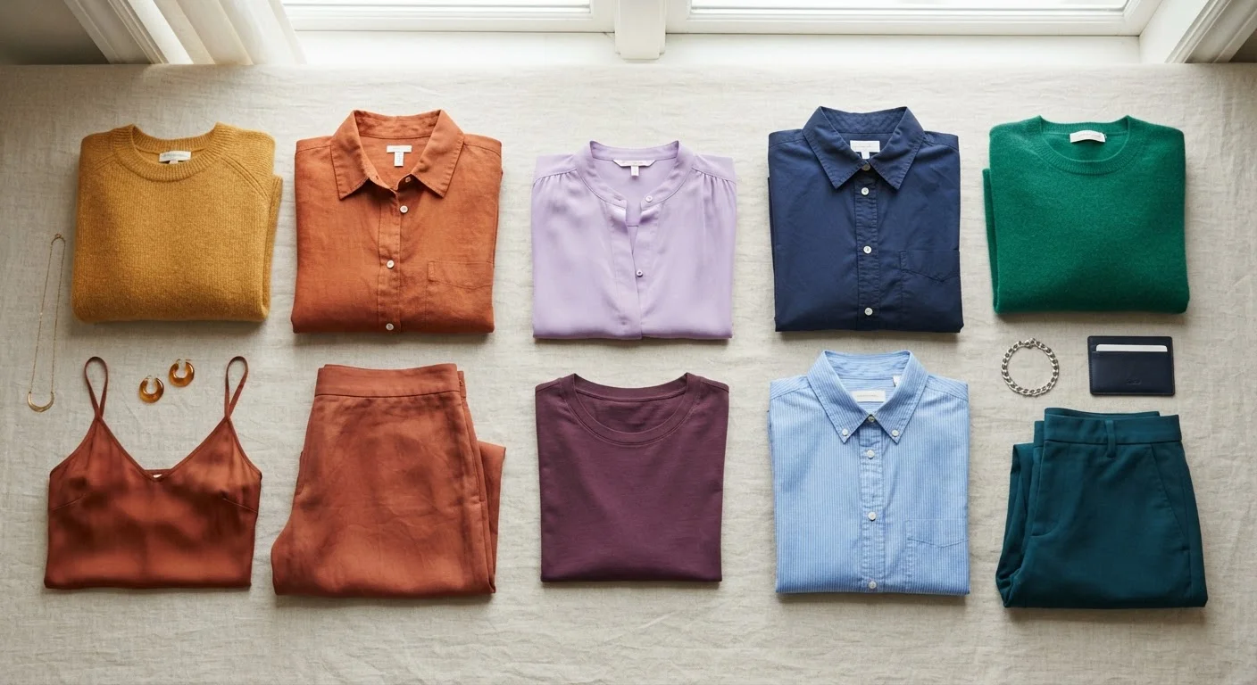
Analogous colors are neighboring hues on the color wheel — think rust, terracotta, and burnt orange. Because they share undertones, they blend naturally and require minimal effort to coordinate. This approach is ideal for creating cohesive, tonal outfits.
Many stylists suggest that warm undertones in skin tend to flatter warm hues (earthy tones, warm reds, golden yellows), while cool undertones are complemented by blues, purples, and cool-toned neutrals. That said, these are starting-point guidelines, not rules — personal preference and confidence matter most.
The content on this site is for informational purposes only and is not a substitute for professional advice. Always consult a qualified professional for guidance specific to your situation.